Very Nice Bob, good to see a DH88 in something other than Red. Well done
Guess I'm not doing the red one next... :facepalm
The Green one was cool.

Modelers Alliance has updated the forum software on our website. We have migrated all post, content and user accounts but we could not migrate the passwords.
This requires that you manually reset your password.
Please click here, http://modelersalliance.org/forums/login to go to logon page and use the "Forgot your Password" option.
Very Nice Bob, good to see a DH88 in something other than Red. Well done

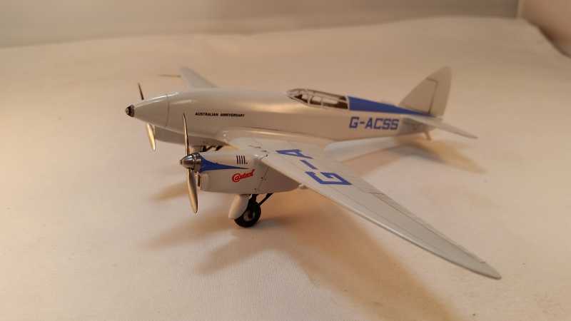
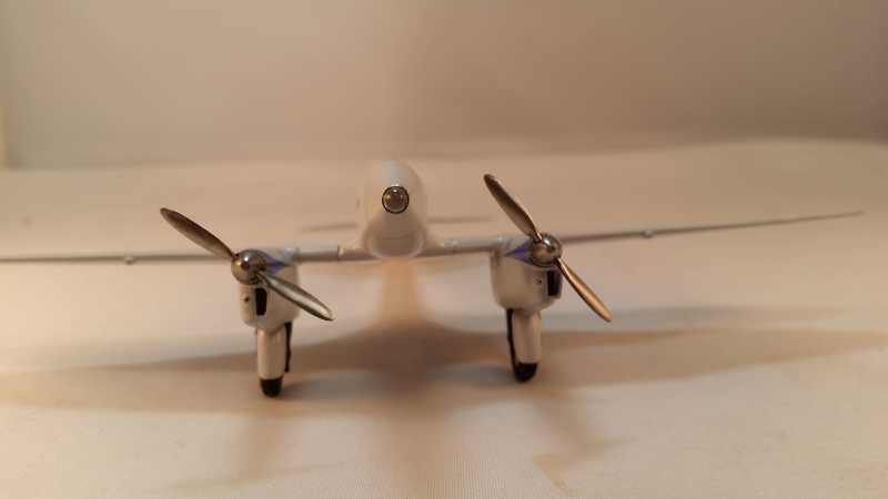
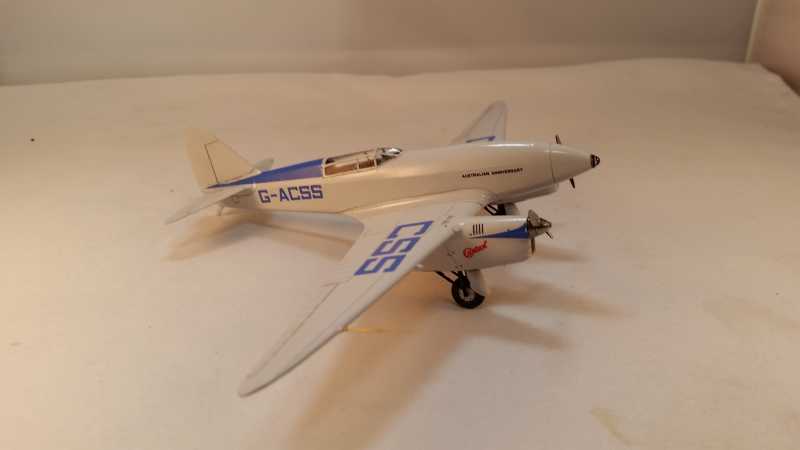

I wonder if those guards protected the tires from stuff thrown back by the prop or stopped stuff flinging of the tires into the prop.
I wonder if those guards protected the tires from stuff thrown back by the prop or stopped stuff flinging of the tires into the prop.
I tend to lean towards a streamlining feature .
Cheers, Christian B)
I wonder if those guards protected the tires from stuff thrown back by the prop or stopped stuff flinging of the tires into the prop.
I tend to lean towards a streamlining feature .
Cheers, Christian B)
The gear were fully retractable but they were not fully concealed.
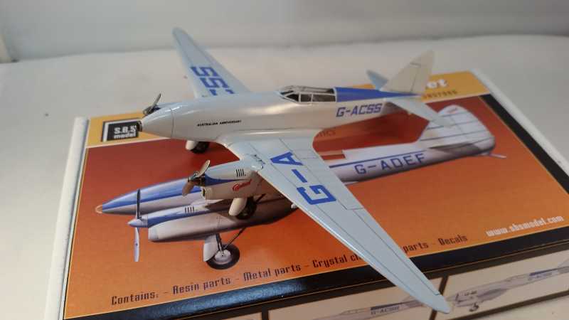
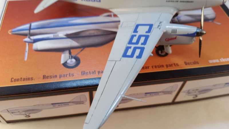
It may be the photo, but the outside aileron area looks very dark compared to the rest. If anything (in my mind) that would be lighter since it's a moving surface.
It may be the photo, but the outside aileron area looks very dark compared to the rest. If anything (in my mind) that would be lighter since it's a moving surface.
My thinking is it would be darker because it's a movable surface, the leading edge of the aileron would be deeper as opposed to a panel that's flush with it's neighbor. I do need to make them more consistent, seems to taper off.
Using the wiki photo we can see that the panel line behind the leading edge of the wing is pretty much invisible but the aileron, as well as the rudder and elevator, are well defined, that's what I'm going for.
https://en.wikipedia.org/wiki/De_Havilland_DH.88#/media/Filee_Havilland_DH88_Comet.jpg
I guess I'm still stuck in armor mode. I was thinking the wash was where grime would collect.
I hear you regarding the aileron and elevator are definitely darker than the surrounding areas, maybe it's the striking difference between the grey and the wash thats catching my eye.
I'm not intending to criticize, I love your build.
