• Modelers Alliance has updated the forum software on our website. We have migrated all post, content and user accounts but we could not migrate the passwords.
    This requires that you manually reset your password.
    Please click here, http://modelersalliance.org/forums/login to go to logon page and use the "Forgot your Password" option.

Painting Red !

AndyFettes

Master at Arms
Hi all,..

Has anyone got any tips on painting reds as Im doing some at the moment and mixing reds with flesh tones to get highlights but Im ever increasing the tone to a more pinkish hue which I dont want.

Im using Vallejo by the way

Please help :(


Andy
 
red is a troublesome color, very bitchy!

the best way to highlight red would be to use yellow and white carefully or - like you already did - flesh!

but since you want to avoid the off-color try to take another approach of using a lighter red tone of the color you already used!

e.g. if you are using carmine as a basic color and vallejo offers a "light carmine" then take this shortcut for the benefit of your nerves! maybe you combine acrylics with oils - in this example here vallejo carmine as basic and light carmine by an oil paint manufacturer of your choice!
 
:unsure: Reds can be very difficult but I find the secret is to reverse paint, to keep the vibrant color. Paint a base of white acrylic. Then a red acrylic. Dry brush and highlight as you please but don't worry too much about fading.
Next get a nice red in Artist oils (vermillion is nice)and get a good covering on your brush, then take off most of it until the red is quite dry and only comes off with a repetative stroke. Apply this in varying intensity over the area and try to get a mottle effect through inconsitency.Stay away from the edges and only work from the centre out.
After it is dry flat coat it with an acrylic flat and add any filters or washes you want.

Hope that helps.
Ian.
 
Andy,
You can highlight red using orange. This will not turn the red pink. Also using different shades of red like Laura stated starting from the dark to the lighter reds.
Cheers,
John
 
Hey there,

I strong disagree to using white to highligh red. Yellow to a lesser degree although it will give you an extreme highlight - and you'll need many very convincing transitions to take your red base coat up to yellow.

As John and a few of the other posters above have mentioned orange seems to be a better route to follow when highlighting red. Flesh should work as well (although you haven't told us which AV flesh you're using), I'd say Sunny Skintone should work well (off the top of my head), and Brett Avants recommends Orange Brown.

Here is Brett Avants' red uniform mix: http://www.coloradominiatures.com/infovallejopaints.aspx#reduniform

I can't say I entirely agree with the use of black to create shadows though - it's as an extreme colour as white. If one does use black to shadow it should be done extremely conservatively.

Here's some red work I did on a WH 40K figure:

DSC02845_copy.jpg
DSC02847_copy.jpg


My process for this was (in Citadel Colours):

BC: Scab Red
HL1: Red Gore
Wash: Red Ink + Black Ink (this really should be a hint of black - alternatively use brown ink)
Repeat HL1
HL2: Red Gore + Blood Red
HL3: Blood Red
HL4: Blood Red + Blazing Orange (3:1)
Glaze: Red Ink

HTH

R~
 
Andy,
I could not give the colours before as I was not home. :blink
I use oils so the oils I use are as follows.
Cadmium Red deep
Cadmium red
cadmium scarlet.
This will give me three distinct shades of red and a final highlight of Cadmium orange.
For the shadows I will mix veridian with the cadmium red deep to darken the red and will also add a touch of either blue or violet to give a purple tint. :unsure:
As you can imagine this combination gives a lot of variation of red including shadows.

To do this in acrylics Rudi has given you the names of some of his red colours, the main thing is that he also has several colours of red going from dark to lighter but still a red colour and not pink. Their are different names for the colours of red depending on the manufacturer of the acrylics. You will not get a good highlight just by using one colour of red and trying to highlight it. Try for at least three variations of red colour from dark to light. :eek:hmy:
The complimentary colour of red is green that is why I use veridian to darken the red.

The following theory is difficult to understand but is very true, and I try to keep it in mind all the time. Remember that 50% of gray is Black and 50% of gray is white. Anytime you use either white or black you are adding 50% of gray to your mix and the colour may gray down. :woohoo: There are always exceptions to this rule as usual.

Hope that this little observation will help and that I was not to long winded. :S

Cheers
John
 
Tank-you all for your very informative posts I am going to pratice tonight with your advices

Tanks once again and best wishes to all

Andy

Further to my post heres a shot of my redness progress I think the picture has washed out the differences in tones but Ill upload it anyway

Cheers all :)

img_2448_20100304_1057240470.jpg
 
I have a degree of red/brown/green colorblindness- not a big challenge for a professional illustrator, right? In addition to being spotted by my art directors ;) , I use reference pics and Photoshop to get my colors right. In any painting program- and there are several good freebies available, there's a color picker palette. Simply open a color picture, than pick on the areas you want to duplicate. It's show you in a window that looks like this:
color-picker.jpg

I'm always amazed at the different grays and tints that I find in areas I'm dead sure will be a different hue or value. Hope this helps on a tricky subject-

Cheers!
chuki
 
White seems the logical choice to highlight red with but unless you are very careful with it's use 9 times out of 10 all you end up with is varying shades of pink. Yellow can be useful but again you need to limit it's use to more extreme highlights or things will end up too orange. :angry:

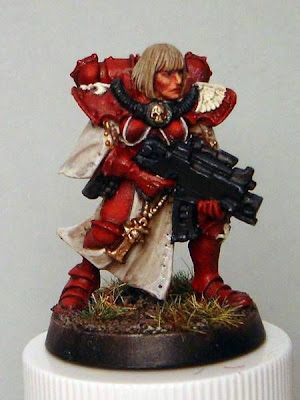
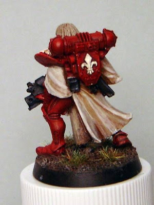
Red can be an awful colour to get decent coverage on for starters but I have found that by using GW's Mechrite Red Foundation paints you get one coat base coverage. Don't worry if it doesn't look the right red when you use it as a basecoat because it is easily hidden by your red of choice when applied over it. 2 coats for a great red base and no detail fill in. ;)

Now, getting down to the actual painting..... The most useful tip given to me by one of the best fantasy figure painters around is if you want to avoid the traps of highlighting red then don't highlight it.

That means start with the lightest red you wish to use rather than a midtone and only apply shading making it gradually darker where necessary.
As a result, painting red is now one of my favourites rather than one I avoid.
If you still wish to highlight when finished then you can apply either a salmon (preferably) or an orange/yellow to the most extreme areas.

For another piece of useless trivia, when painting red I use the following Vallejo Model Colour paints....

817 Scarlet - 909 Vermillion - 908 Carmine Red - 926 Red - 814 Burnt Cadmium and if you want to go really dark you can either apply a touch of black to the Burnt Cadmium or use 859 Black Red.

For small areas just cut out a colour or two :)

Some of the figure painting sites are great for advice on painting certain colours.
 
Back
Top