• Modelers Alliance has updated the forum software on our website. We have migrated all post, content and user accounts but we could not migrate the passwords.
    This requires that you manually reset your password.
    Please click here, http://modelersalliance.org/forums/login to go to logon page and use the "Forgot your Password" option.

American Southwest, Circa 1876, Sioux Warriors vs US 7th Cavalry

Reddening the Flesh Tone

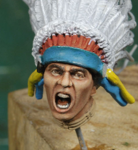
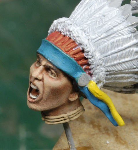
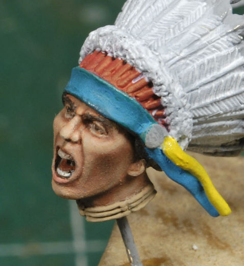
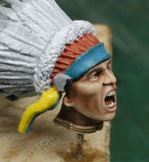
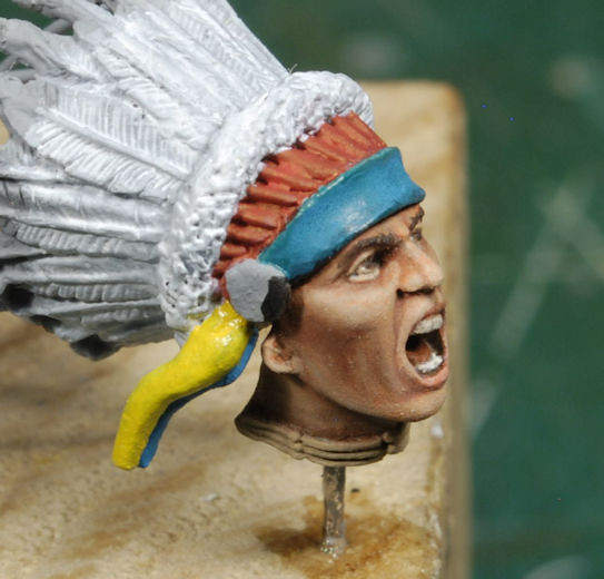
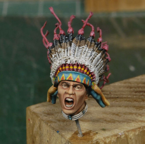
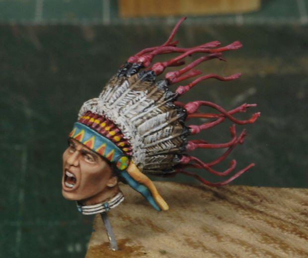
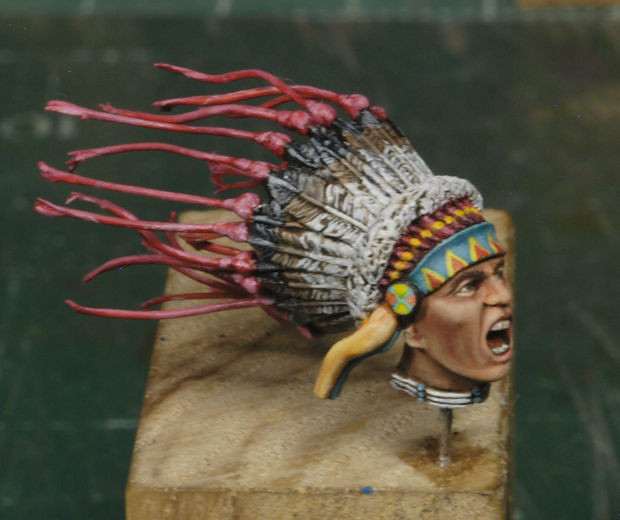
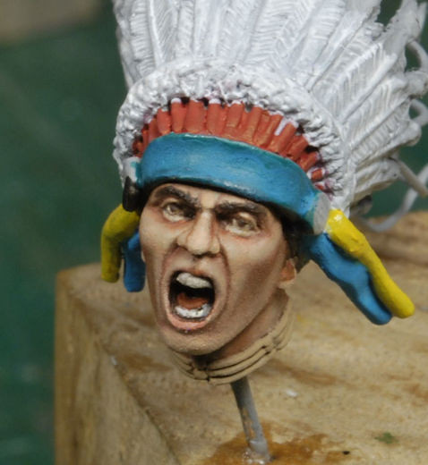
After a closer review and a few comments by fellow modelers I decided to adjust the flesh tones a bit more towards the red to intensify the sun exposed skin tones. Many of you who paint figures as your sole hobby have mentioned that the initial run looks just fine, and I appreciate the input. But something was telling me that the cheeks were too light and needed to be toned down. I was very careful not to work the brush too damp as that has a tendency to “lift” the prior work and jack the whole canvas requiring major surgery, or an oven cleaner bath, which is way worse. I’ve had this happen many times and it’s a kill joy. Common, you’d think after all this time I might have learned something by now, right?

So, only with a side-by-side comparison are we really able to see the slight feathering in of the more reddish tones for the chief. I kept it very subtle initially. I will hold it at this level and adjust for the other four riders making slight variations of intensity. The Sioux Indian territory, known as the Great Sioux Reservation, originally covered all of South Dakota west of the Missouri River and parts of Nebraska and Montana. These guy got plenty of sun, but they are nowhere near the intensity of the Apache or the Navajo.

Note of caution, a point to remember. The lens always shows what we either have not caught yet, or ignore completely, those pesky tiny lint balls or bits of dust or hair. I typically run a thorough scan before Dull Coating my figures, because there’s nothing more embarrassing than presenting work that has taken months only to have everyone see lint or dust on the final production. It smacks of a lack of attention to detail, imho, and I’m guilty just the same. So, these guys will get a good review before we call them done, no doubt.

Frontal comparison.
_DSC0370c-vi.jpg
_DSC0382b-vi.jpg


Left side comparison.
_DSC0373c-vi.jpg
_DSC0385b-vi.jpg


Right side comparison.
_DSC0374c-vi.jpg
_DSC0387b-vi.jpg


I haven’t spent too much time in research for this vignette other than skin tones and the Trooper’s gear. I have yet to take a deep dive into the Indian gear, customs, and typical decorations for each tribe. I just haven’t gotten that far. But thankfully Bob Knee has done the research and printed an article with very useful information. Doug, AKA dmcHobbes, has kindly posted the article here: https://www.planetfigure.com/threads/native-american-flesh-tones.270044/#post-1094667

I will be referring to this, among other articles, before I get deep into the details. Hats off to Doug for posting and thank you, Bob, for the write-up.

Feel free to comment and thanks for watchin. More coming soon. Cheers, Ski.
Once again, just brilliant. I feel like the tones are closer to what I think of as natives.
Out of a "how did he do that" curiosity, did you use transparent glazes or a more dry approach? I get the sense you used dry since you mentioned not working too wet.

I like to work wet, and use glazes extensively on my figures as well as fine art paintings. "Liquin detail" medium and a pigment paint that is naturally transparent works great for this. However, the underlying layers have to be completely dry (like, 4 to 8 weeks with oils, 1 if underlying layers are acrylic). I generally leave the underlying layers "lighter" than what I want because the glaze will give the correct values once it is applied. It is a really good technique although it tries my patience. :soldier

I almost don't want to post that as it may sound like a criticism and it absolutely is not. It is just a comment on how two artists work differently to arrive at the exact same place.
 
Lol, Bob, it ain't that deep Bro, I'm wingin it anyway, HA!

Once again, just brilliant. I feel like the tones are closer to what I think of as natives.
Out of a "how did he do that" curiosity, did you use transparent glazes or a more dry approach? I get the sense you used dry since you mentioned not working too wet.

I like to work wet, and use glazes extensively on my figures as well as fine art paintings. "Liquin detail" medium and a pigment paint that is naturally transparent works great for this. However, the underlying layers have to be completely dry (like, 4 to 8 weeks with oils, 1 if underlying layers are acrylic). I generally leave the underlying layers "lighter" than what I want because the glaze will give the correct values once it is applied. It is a really good technique although it tries my patience. :soldier

I almost don't want to post that as it may sound like a criticism and it absolutely is not. It is just a comment on how two artists work differently to arrive at the exact same place.
Thanks, Greg, and no worries, took it as intended. I haven't monkeyed with glazes before, so this far into the game I'm staying clear, even though I've got a bottle at the bench. I just never saw a need for it. What I have altered in the approach is going much dryer, you are correct. Having more thinner worked into the mix gives a quicker work time for the next phase, almost like acrylics. Ugg, there's that nasty word again, HA!. But, like I said, it can lift the prior work, so caution is the watch word for me. There's a vid link from Milan which gives a great run down on the process. The only difference is I started with a grey canvas, but I will pre-shade with acrylic base the next one just to see how much easier it is to work the oils. Trial and error, crash and burn, start over, still fun.

I'm thinking you may want to heat dry your figure, (I use and old hair dryer), to cut down the dry time and dull coat it, continue on. I've done that a lot in the past, just the old rattle can. I know, it sounds crazy these days, but if it works, I use it. Or AB a coat, either way works the same.

I'm working the feathers right now just to keep momentum and did a light "dark wash" to amplify the details but need to go back and tone that down a bit and amplify the highlights. It's not a major boof but could turn into a disaster if I'm not careful. Slow and steady.

Tanks for watchin, Gents!
 
That really is subtle even on my 4k monitor. I think when you get to this stage people will all see it different and so will their screens so its down to the artist and what satisfies him. I noticed when i was building my last bike how dificult it is to relay colours let alone tones via a screen

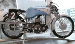
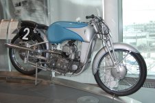
2ae6a3cd229384d7151302274db02041.jpgDKW 250 US 1939 Motorcycle.jpg same bike same light, take your pick. The 2nd picture the guy has reduced the background light and probably used a center weighted exposure so is likely the right colour.....

Bottom line is if you are happy..... aint no one going to argue with you :)

PS..... My spell check is set to UK English but it still thinks colour is color, i need a better spell check :rotf
 
Back
Top