• Modelers Alliance has updated the forum software on our website. We have migrated all post, content and user accounts but we could not migrate the passwords.
    This requires that you manually reset your password.
    Please click here, http://modelersalliance.org/forums/login to go to logon page and use the "Forgot your Password" option.

Alone and in Jeopardy...

Thanks guys! Been working when I can on my two dioramas (vignettes?)...I'll be glad when summer starts Friday afternoon and I can take more time in the shop.

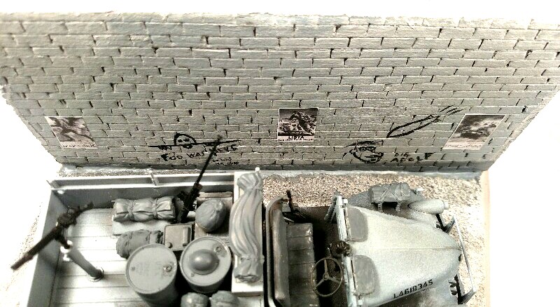
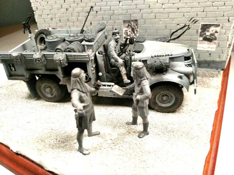
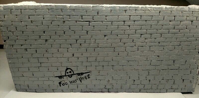
Worked on the brick side...I know Kilroy was pretty much an American GI thing so after doing some research, I found that in WWI, the Aussies had pretty much the first iteration of the theme with Foo- which might stand for Forward Observation Officer? Either way, I liked the idea of having a remnant of the Great War in this piece...still will add more to the wall but it's a start.
IMG_20180619_172712.jpg


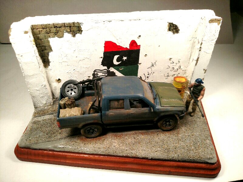
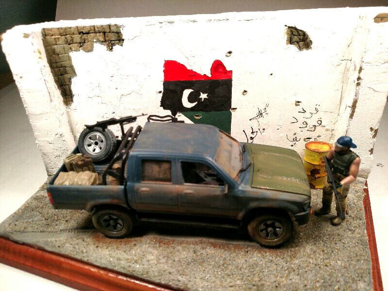
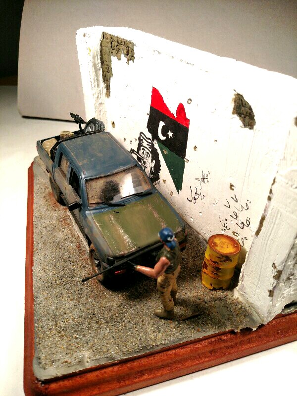
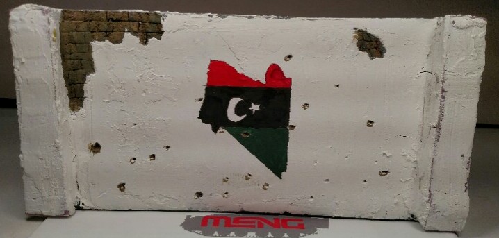
On the color side, I figured handpainting a Libyan flag piece from an online photo I came across would make for more color...still have graffiti to add but I'm pretty happy with it.
IMG_20180619_172735.jpg
 
Thanks again everyone!

B&W side is nearly there...took these pics so I could better see the area's I need to touch up....

h0383ed5_2018-06-27.jpg


h383b313.jpg


h0c32cd8.jpg


And the color side of the wall is ready for terrain work...

h40f44dc.jpg
 
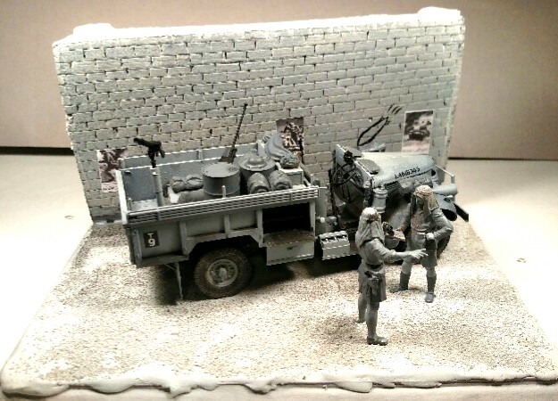
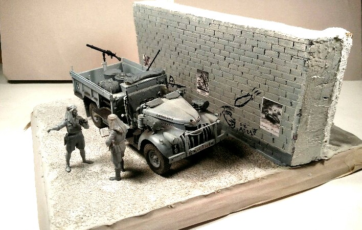
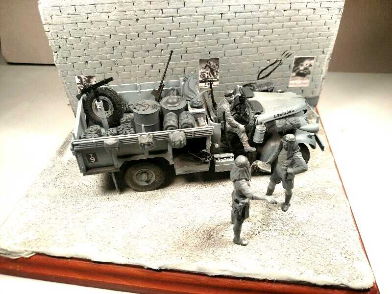
Well...I'm thinking I'm nearing the end on this one. Other than maybe some more stowage in the pick-up. Open for any advice or critique. Thinking of calling it Ghosts in the Desert.


h9cb6243.jpg


h8c2e980.jpg


h9f80cac.jpg


h70ba577.jpg


hd455651.jpg


h9344c03.jpg


h6e944f3.jpg


h1aba6d4.jpg
 
This turned out great Mike , the color - b/w thing is a very cool aspect .
Good , now that you're done you can start stacking firewood , mine should be showing up in a couple of weeks . Matter of fact I'm going surf fishing with the owner of the tree service in about an hour .
 
Ugh...been way too hot for that Glenn ;) Apparently NY thinks it's Florida this summer and is having a major identity crisis...

Thanks for the looks guys!
 
(y)
What a great concept...i love it!
The contrast on either side of the wall really works as does the 2 variations in technicals.
:notworthy

Ian.
 
Just an observation. The B&W truck and figures all look like they are a blue-grey. The ground and wall on that side don't seem to have the same type of grey. I'm wondering if you were to take a sepia ink and give it all a light coat to give it a sepia type tint so that it would all have a consistent brownish sepia look then it would blend together.

The concept is awesome and your execution so far is superb. Just something I am picking up on.

med3d-ennuye.gif
 
Back
Top