• Modelers Alliance has updated the forum software on our website. We have migrated all post, content and user accounts but we could not migrate the passwords.
    This requires that you manually reset your password.
    Please click here, http://modelersalliance.org/forums/login to go to logon page and use the "Forgot your Password" option.

Stalingrad`s 44-45 German POW SBS/Review

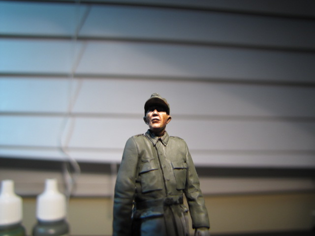
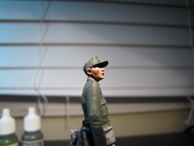
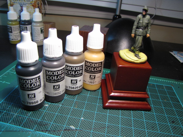
Next up when all dry of course I begin to bring out some high lights and doing this I use less and less BCR is the mix until I have pure
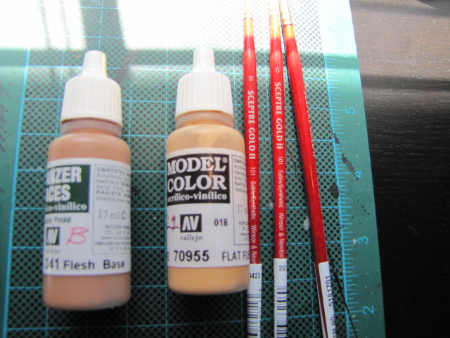
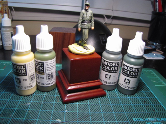
Vallejo 341 flesh base

IMG_0867.JPG


IMG_0868.JPG


IMG_0869.JPG


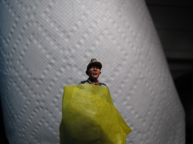
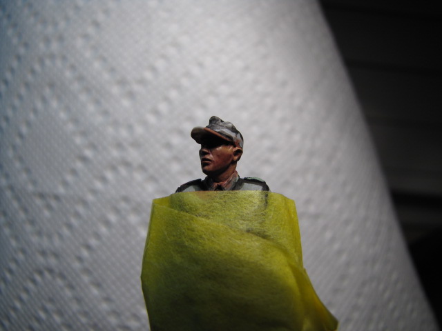
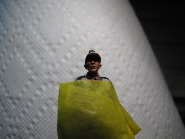
Next I will do more highlighting but this time I will add lighter colours to the flesh base

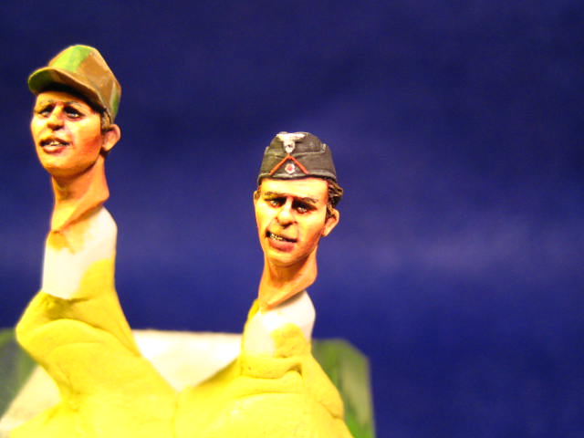
I hope the photography is not making it too difficault for you see what Im trying to do


Heres a quick Andy tip # 1 :coolio

If like me you are strapped for cash and cant justify shelling out big bucks for a windsor and newton series 7 brush $22 in most shops,... try the windsor and newton sceptre gold 2 range which can be bought at places like Blicks for under $10

tip # 2 :coolio

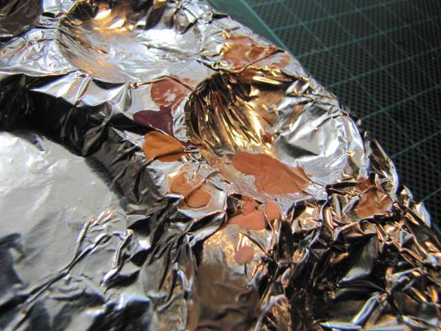
reuse your favourite palette by covering it in kitchen foil, this gives you many many mini palettes if you crunch up the foil first and then cover the original palette

afterwards you just throw the foil away (y)

tip #3 :coolio

If you are forgetful like me then write down all your mixes and ratios on a file card or on your computer then when you go back and want the same effect you have it ready to hand instead of trying to remember what you did in the first place
 
Great stuff, Andy! Would you please include a shot or two of your palette while you're painting to show the paint consistency? That would be helpful. (y)
 
Bob, yes, just the 2 colours,.. it makes life simpler at this stage

to simplfy even further I could add just one more colour to the base to bring out the highlights I can do that if you want however I usually use 2 and then a off white for minute highlights

Re the palette,Mike, I will do but suffice to say that the consistency is very thin but I do add "Golden" acylic flow release to make thin coats even better without getting those annoying water marks on whatever you're painting.

I hate wasting paint so I dollop small drops each time then mix em up

I always use a shot glass ( another link to drinking ) filled to the top with distilled water then a few drop of the flow release and just mix it up and whenever I go back to the water I give a quick mix

I stick this shot glass to the cutting matt with a small lump of yellow tac so you cant knock it over.

Heres the palette you can see I put the main body of paint into the middle and then mix up round the edges in my mini palette pockets

IMG_0873.JPG


The paint set up as a whole

IMG_0875.JPG


whats next,... flat flesh added to the base colour and again ill add less base until i get to pure flat flesh then I could do that again with another suitable colour

IMG_0874.JPG


Hoping this helps
 
Good Step By Step so far,Andy! (y)

Got a question.Do you ever use the Vallejo Retarder,and if so what's the best way to use it,how much paint
to retarder ratio?

Greetings,Ron.
 
Hi Ron,

I have used the retarder but didnt really get on with it that well I dont think I gave it enough time to check my progress

As with my flow release Id add it to the water before adding to the paint as one of my sessions made the paint glossy ( I think i put too much in ,really)

ratios ? sorry couldnt tell you mate

Ive got both Vallejo and Reaper slow drys and may return to testing these out again when I have more time for a better reply mate

but suffice to say add a little bit by bit and test from there
 
Hi Andy,

Any progress from the master ??
Remember we are eager to see how you brew your beer :gogo

Talking about beer. Im gonna take one :cheer:

willem
 
Let me please say that I apologize for not keeping up with the updates on this

working late most evenings and not in the mood to do anything let alone dig the paint out but rest assured that I will be back on this really soon

I thank you for your patience

Andy
 
hi all heres a quick update,...

adding the 2 colours in the previous picture we can now build up some highlights especially to the upper cheeks nose bridge upper lip and the chin

IMG_0877.JPG


IMG_0878.JPG


IMG_0879.JPG


It looks a bit better when the hat and tunic is colour blocked in which gives some contast, however my pictures and subsequent lighting again let me down so youll have to bear with me with this

Have a look at 3 heads that I have done in the past ,all are Alpines and are superbly sculpted
The highlights here are again across the forehead nose upper cheeks top lip and chin


IMG_3469.JPG


IMG_1764.JPG


the last one was painted a bit bolder than I usually do them and the bottom lip is far too dark and needs to be lightened when he finally gets to be attatched to a body,the face is not finished and the shadows and highlights need more blending but good for an example of what i am trying to put across..( he currently resides, with his mates, in the head section in my display cabinet ) :rotf

once again I do apologise for being slow in continuing this SBS
 
Thanks mate,...well this is why Im doing this SBS` to give someone who hasnt had a go at figures before to chance to do so

go on dip your brush,..............

Mike and James, cheers fellas
 
This is going to shock you all but,..yes its true I have finally done some more to this SBS !! :eek:hmy:

Going forward I have now completed pretty much the uniform

Heres the pics so I can explain better,....

Throughout this SBS its no secret but I am quite fond of this figure,..but,..I am not all that happy with the face (especially the painting ,..thats crap )oh well,...

The uniform jackets pockets are far too low, the sculpting of the breast eagle is not good etc etc but anyways to continue,.......


IMG_0892.JPG


IMG_0893.JPG


IMG_0894.JPG


IMG_0895.JPG


IMG_0896.JPG


As you can see in the last 2 pictures I have shown the paints Ive used for the uniform green and also for the boots ( some of you may recall I love painting boots for some reason ) :idonno


For the Tunic and trousers they were both base coated in Fieldgrey and then highlighted with brown violet in small increments and then further highlighted with beige,....the shadows were done simply by adding light washes of German camo dark green,..heavier in the darker areas under the arms etc etc

Boots were painted black as a base then German black brown was added to that then German camo medium brown and finally for the higher lights dark flesh was then added to the mix,...black was then washed to get the depth and shadows back.


This is where I am going to leave him,...I have no intention right now of putting him on a base as a solo figure because to be frank I don't think hes good enough,.I will however be adding him in the background somewhere in a future project

If you have any questions please please shout them out,...I have returned to painting after a long lay off and possibly I have not done this figure justice but when you compare him to say an Alpine figure then you can tell there's a wide divide between the two,...and an blank figure canvas thats well sculpted seems more enjoyable to do.

Stalingrad is not a bad company at all and they have some really good figures within this range and this is not an totally awful figure in fact hes quite ok,..I love the folds sculpted on the trousers,..they are very very good,..but I do feel that the pose is quite boring and perhapes a bit of modification to the arms can produce better animation its pure personal taste that makes me make these comments so please take them a face value and its certainly up to you to decide should you wish to purchase one in the future

As a starter figure this could very much work for you !

I would personally like to thank James k for supplying this figure ( and the time its taken to do this SBS/review he probably wished he hadnt ) :D :laugh:

Cheers !! :drinks :drinks :drinks
 
Who are you and what have you done to our Andy? :silly:

Thanks for the effort anyways,mate. (y)


Greetings,Ron.
 
Back
Top